Hola Cultura
A growing nonprofit wants to better communicate who they are and what they do.
The Current Situation
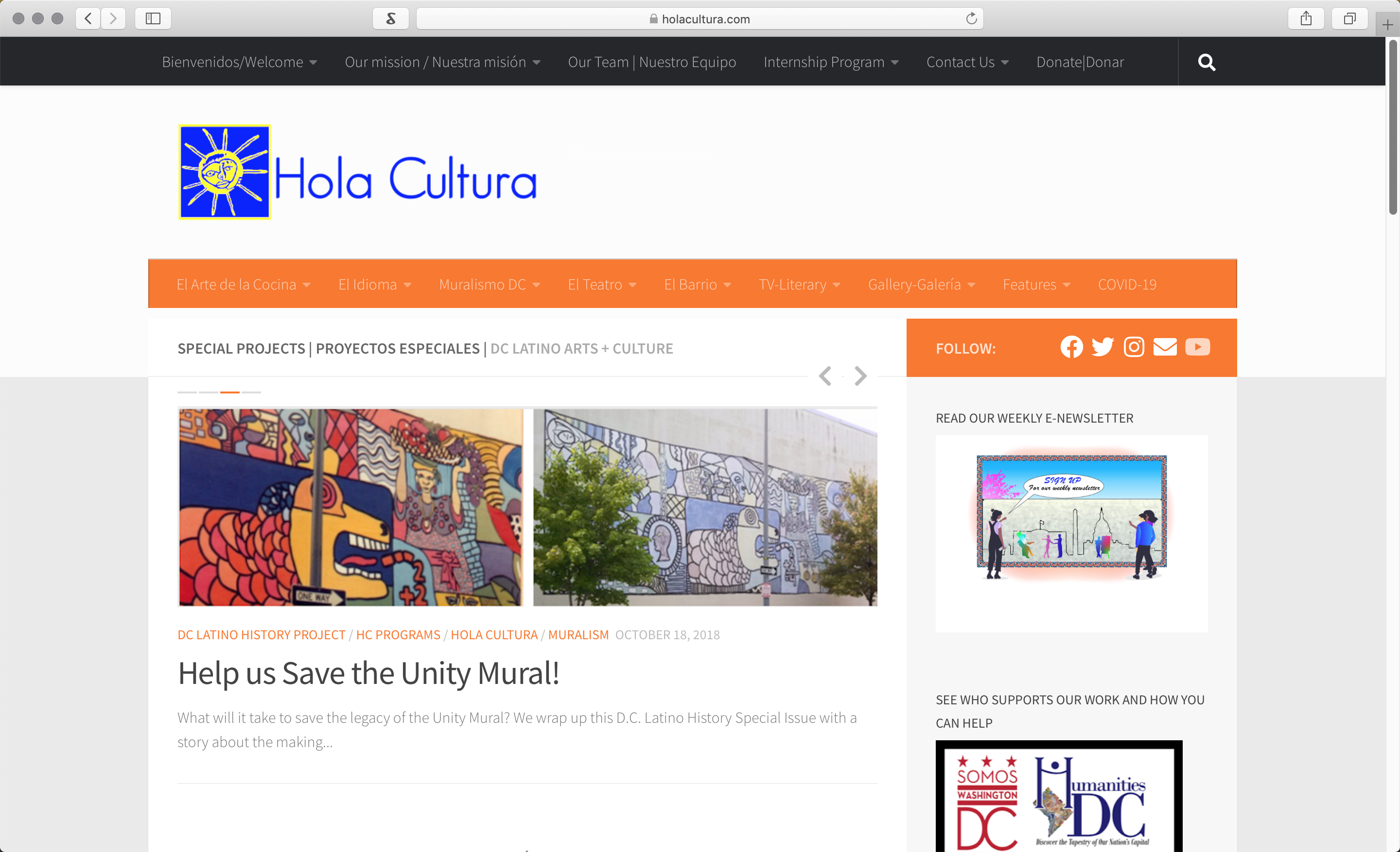
Hola Cultura uses a single website to showcase who they are, what they do, and their original content. The current design leaves users confused and overwhelmed by the amount of information shown.
The Plan
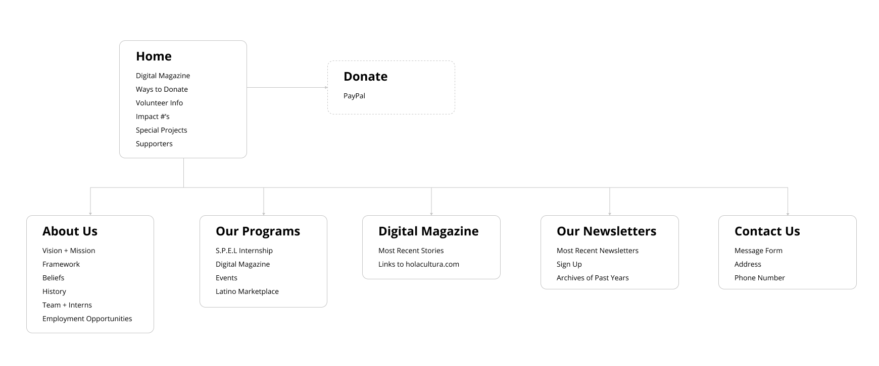
By working with stakeholders, content was organized and sorted to best show what Hola Cultura offers and what the organization stands for.
The Prototypes
Because there were no existing brand standards, typefaces, colors, and graphic elements were added and created to expand the brand itself. You can follow the link here or below to view my interactive prototype.


